

At Sheaffer, color plays a quiet yet powerful role in how a writing instrument is experienced. It is never just a decorative detail, but an element that shapes how a pen connects with the person who uses it. The shade of a pen can influence how it feels in the hand, the impression it creates, and the connection a writer forms with it.
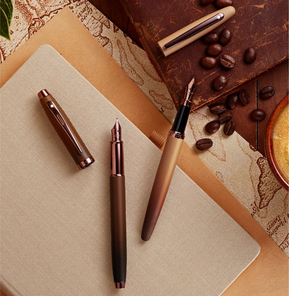
Coffee Edition
The Coffee Edition introduces warm tones such as coffee brown and deep espresso brown, complemented by elegant trims, inspired by the comforting ritual of coffee and writing. These rich hues bring a sense of warmth and familiarity while maintaining a polished and timeless look. Together, these tones create a balanced and sophisticated finish that reflects the collection's classic character.
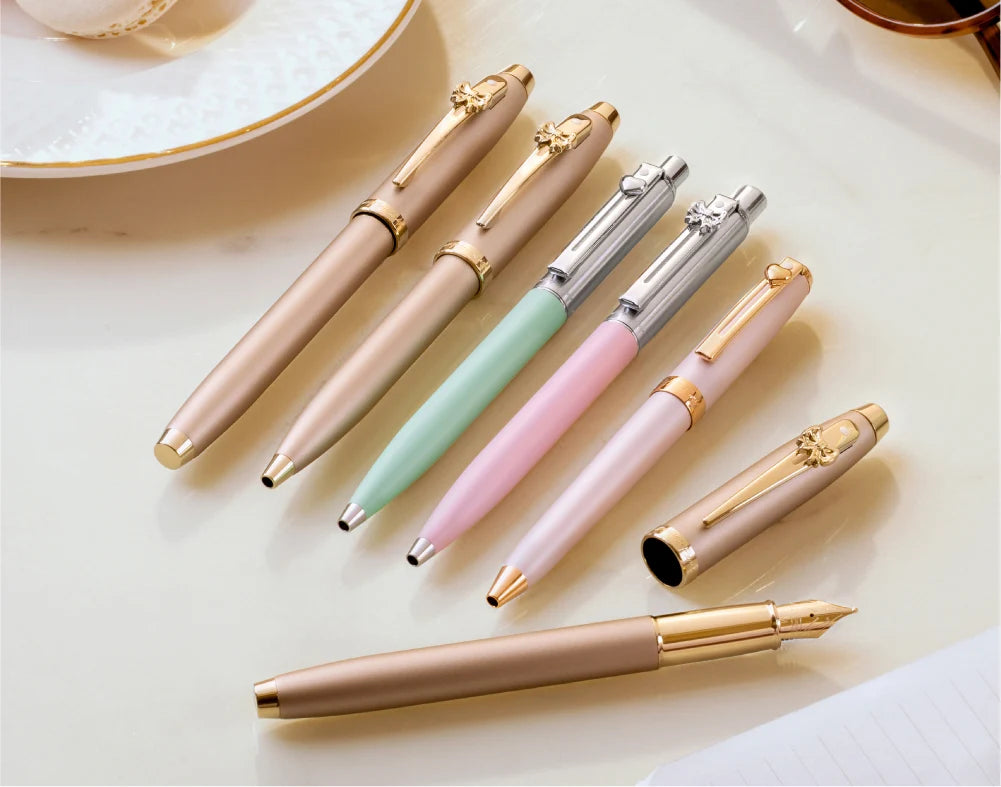
Emily In Paris Edition
The Emily in Paris Collection showcases delicate shades such as pastel pink paired with champagne and rose gold-toned trims, reflecting the charm and effortless style associated with Paris. These soft tones bring a light, fashionable character to the design while maintaining the refined craftsmanship that defines Sheaffer. The balanced combination of pastel color and elegant metallic accents creates a writing instrument that feels both stylish and timeless.
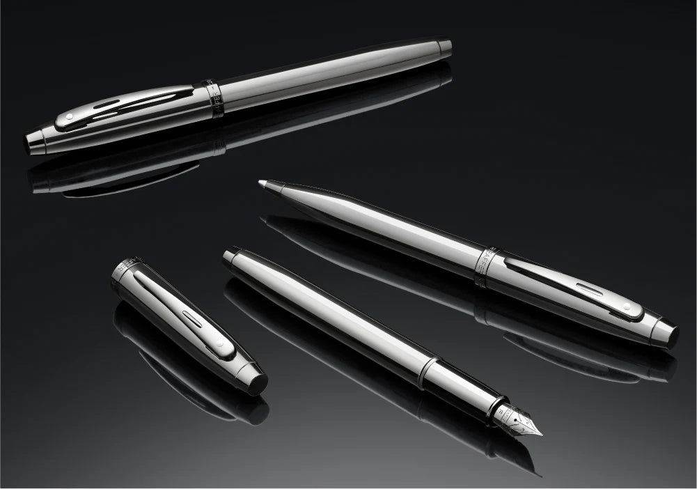
Sheaffer 100 Metallic
Finishes such as PVD Gold, Satin Blue, glossy black, gunmetal grey, and chrome accents highlight the timeless elegance that defines many Sheaffer collections. These polished tones bring a refined balance between color and finish, creating writing instruments that feel both classic and contemporary. The combination of rich hues and precise metallic detailing enhances the overall design, giving the pen a distinguished presence that reflects Sheaffer's heritage of craftsmanship.